Friends were coming over to see the meteorite app, and the one screen I had not made worth looking at was the stars. Twenty-three systems from parallax, the Sun, a dashed ray toward the galactic centre, the plane as a great circle, all correct and all grey dots on black. I wanted it to look like the sky. The honest way to do that turned out to be to use the sky.
The backdrop
The system view already carries the Hipparcos catalogue as an all-sky image, real stars at real positions from NASA's collection, and the build had already measured which way round the image is printed by looking up the ten brightest stars and keeping the reading that finds them. So the stars view got the same sphere behind it, rendered first from a camera that only turns, with the scene drawn over the top. The frame is already equatorial, so there was nothing to rotate and nowhere to hide a sign.
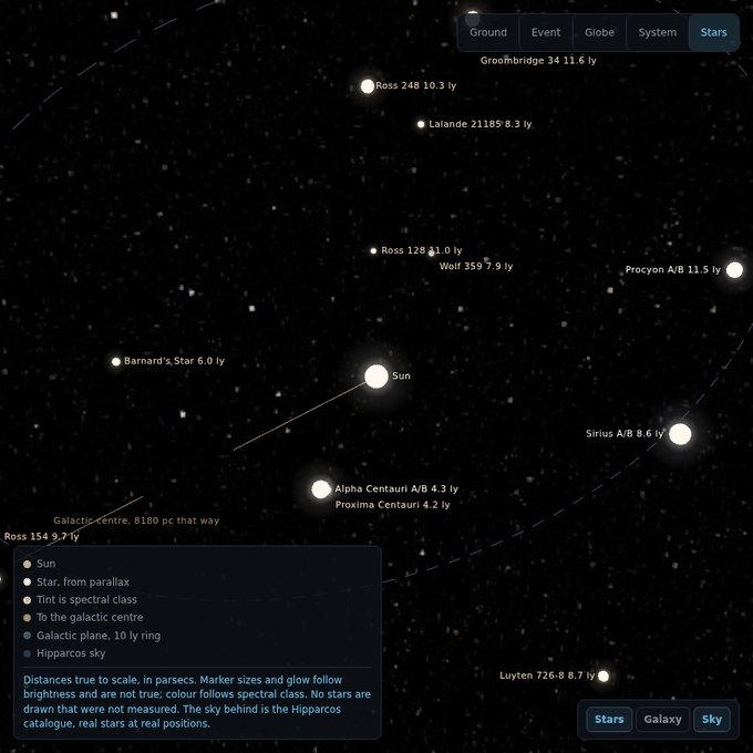
Then the stars got colour. Each row in the table carries its spectral class now, and a small function turns a class into the tint star atlases use: blue-white through white to orange-red, with the subclass interpolating between letters. That is a rendering and not a measurement, and the code says so at the top of the function: it may tint a marker, and nothing downstream may ever read a colour back into a temperature, a class or a distance. The glow round each marker follows the brightness the marker already encoded and adds nothing of its own. The legend says the sizes and the glow are not true and the colour is spectral class, in as many words.
The Sun disappeared
The first render with the sky in place had the labels where they should be and nothing under most of them. The Sun's label sat at the centre next to empty space. Barnard's Star, Alpha Centauri, Sirius: labels, no discs. Two dim red dwarfs near the camera still had theirs.
That picture makes a very specific suggestion, and it is the wrong one. Markers with a glow behind them, most of them gone, the nearest two still showing: obviously the discs are too small and the glow too faint at this zoom, and the fix is to make them bigger. That fix would have worked, for the ones close to the camera, and shipped.
The backdrop was in front of the stars. The sky sphere sits five units from its own camera, whose far plane is at ten, so it writes a depth near 0.98 into the buffer. The scene camera's planes are set from the zoom, and under them a star seven parsecs out lands at a depth of 0.981. Greater than 0.98, so it loses the depth test to a backdrop that is supposed to be behind everything, and the two stars that survived were the two closer than about five parsecs to the viewpoint. The sky has no depth worth keeping, so the buffer is cleared between the two renders and every star came back at the size it always was.
This is the shape every note on this blog keeps finding, in a picture rather than a number: a well formed image, plausible in every detail, produced by something other than what it appeared to show. The label check that runs on this scene passed throughout, because labels are placed by projecting the marker's position and not by looking for the marker, so it counted every label as present beside markers that were not. A label is not a picture. I found it by opening the screenshot, which is the one check that cannot be fooled by the text being right.
The galaxy, as far as it is measured
A second button on the stage steps out from parsecs to kiloparsecs. Here the temptation is a painting: spiral arms, a bar, a glowing bulge, the picture everyone knows. Almost all of it is a model, the arm structure of our own galaxy is genuinely uncertain because we are inside it, and a picture of a population nobody measured is the thing the whole app refuses to draw, whether the population is asteroids or stars.
What is measured is four numbers and a direction. The distance to the centre, 8.18 kiloparsecs, from stars seen orbiting the black hole there. The Sun's circular speed, 229 kilometres a second. Its height above the midplane, 21 parsecs. And the period those imply, 219 million years, which is derived rather than transcribed so that the two numbers it comes from check each other. So the scene draws the centre, the plane, faint rings at five and ten kiloparsecs to read distance off, and the Sun on a circle at its measured radius. Press play and it goes round at its measured speed, with a clock counting the millions of years and the turns. The outline at fifteen kiloparsecs is where an exponential disc has thinned to a few percent of its density at the Sun, and it is labelled approximate in the scene, the panel and the legend, because a disc has no edge.
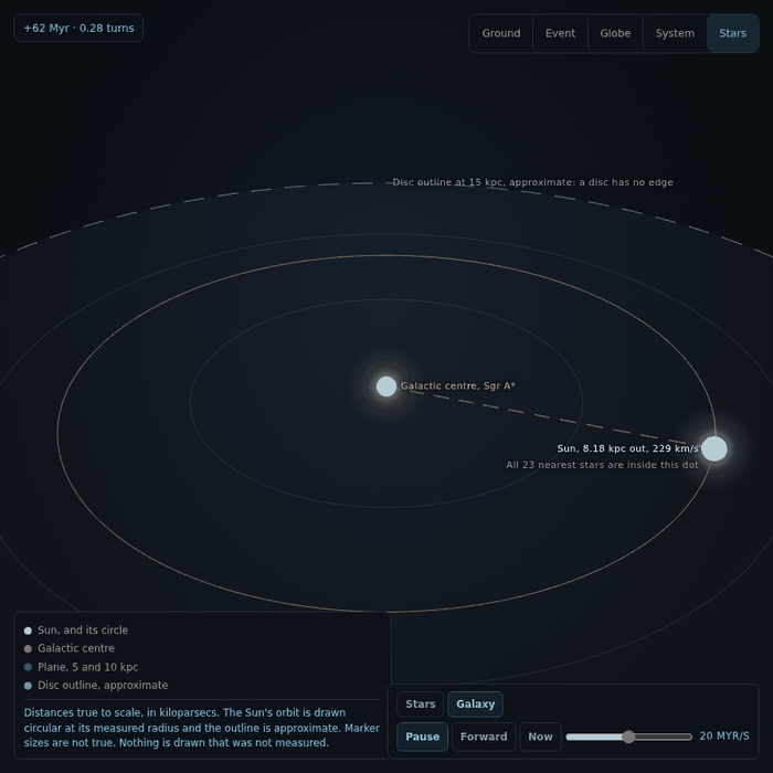
The circle is a circle and the caption says so. The Sun's real orbit is close to circular and slightly out of the plane, and drawing the epicycle would be a model of a model. All twenty-three stars from the other zoom are inside the Sun's dot at this scale, and a label at the Sun says exactly that, because a dot with a single name on it reads as a star alone in the dark. The Hipparcos sky is not shown at this zoom. It is the sky from the Sun, and wrapped round a camera eight kiloparsecs away it would be a sky nobody there would see.
And the phone, again
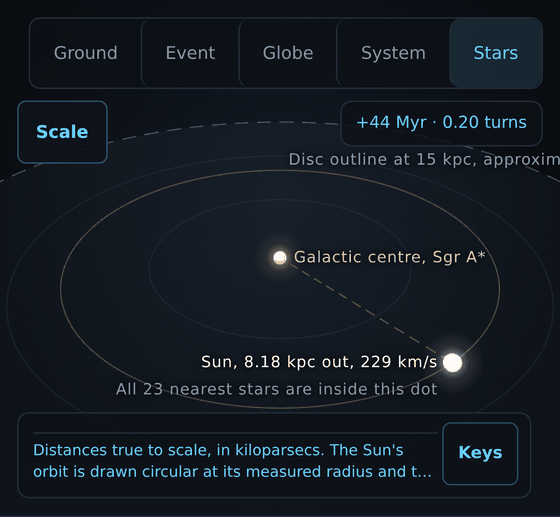
Measured on an emulated phone the whole thing held: no overlay on another, no target under 44 pixels, no label under a box. One thing was wrong that no box measurement finds. The Sun's label in the galaxy view read "Sun, 8.18 k", because labels hang to the right of their marker and the Sun's circle had carried it to the right edge, where the label layer clips. A label in the right part of the frame now hangs to the left of its marker instead, and the collision check reads the flip back so its boxes stay honest. While I was there, the direction a label is pushed to escape an overlay stopped being fixed per overlay and started being read from where the overlay is, because the new scale panel sits at the foot of the stage on a desktop and at its head on a phone, and a label pushed up out of a box at the head lands in the view picker.
It is prettier now, and everything in it is still a measurement. The one thing I added that was not, the colour, is fenced so nothing can mistake it for one. That is the whole trick, if there is one: make it beautiful with the real data, and when something is decoration, write down that it is.